
Risk Matrices Can Mislead More Than They Help
13 minutes
Dr Tom Logan
Co-founder

Risk matrices are widely used in risk assessment and planning, usually as a colour-coded grid showing likelihood against consequence. Although they’re intuitive and familiar, risk matrices often obscure meaningful differences, exaggerate minor ones, and may even lead to decisions that conflict with basic principles of good risk management.
The Problem With Risk Matrices
Risk matrices are widely used in risk assessment and planning, usually as a colour-coded grid showing likelihood against consequence. Although they’re intuitive and familiar, risk matrices often obscure meaningful differences, exaggerate minor ones, and may even lead to decisions that conflict with basic principles of good risk management.
As Cox (2008) observed, many decision-makers believe that risk matrices are “much better than nothing.” But in practice, they often violate the very principles that should guide rational decision-making and can lead to “worse-than-random decisions.”
This post explores why risk matrices should be used with caution, how they distort our understanding of risk, and what better approaches might look like.
What Goes Wrong in Practice: Four Ways Risk Matrices Mislead
When we rely on risk matrices there are four common ways that they can fail to support risk management. These problems show up in real-world decisions about infrastructure, planning, emergency management, and development.
#1. They hide important differences:
A wide range of risks, some rare but catastrophic, others frequent but minor, can end up in the same risk category (often depicted by colour). This makes them look equally risky, even when they’re not. It’s like averaging very different risks into the same bucket, useful for simplification, but misleading for decisions.
#2. They rank risks the wrong way:
Because risk matrices divide space into blocks, they can give a higher rating to a lower-risk scenario. You might end up prioritising something small and frequent over something far more dangerous. In some cases, the rankings have been found to be “worse than random” (Cox, 2008).
#3. They don’t help us act wisely:
Good decisions depend on knowing how much risk you can reduce, and at what cost. But risk matrices don’t show this. Two “high” risks might require vastly different resources to mitigate. A matrix won’t tell you which is the better investment.
#4. They’re based on fuzzy categories:
What counts as “Major”? How likely is “Possible”? These labels sound precise but are open to interpretation. Different people, or different councils, can rate the same risk in completely different ways, even with the same matrix.
Example: Implications in a Council Setting
Consider a council assessing flood risks to three communities. One community is exposed to frequent shallow flooding that causes minor property damage; another faces a rare but potentially catastrophic flood that could threaten lives and critical infrastructure; the third is vulnerable to moderate flooding every few decades.
When these risks are plotted on the council’s risk matrix, the frequent–minor and rare–catastrophic events both fall into the same “medium” category, while the moderate–occasional event is classified as “high” because it sits just across a category threshold.
This raises important questions:
Should the frequent–minor and rare–catastrophic risks be treated as equivalent?
Would they require similar management approaches or investments?
Is the “high” category event the right priority given their different natures?
Would stakeholders (council, community, insurers) agree with that prioritisation?
On what criteria is this classification based, and do those criteria reflect community values and acceptable trade‑offs?
Who and what is ultimately being prioritised under this approach?
By embedding these choices in a colour-coded grid, the underlying assumptions become hidden, and the resulting priorities may be hard to explain or defend.
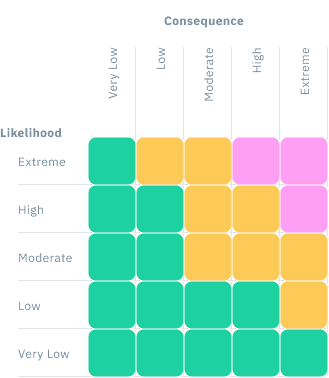
The Four Core Flaws (Cox 2008)
Poor Resolution
Risk matrices divide the continuous space of likelihood and consequence into a small number of discrete categories, typically 3×3 or 5×5 grids. This simplification is what makes them intuitive and easy to use. But it also means they have low resolution: they can’t distinguish between many different risks that differ meaningfully in severity or likelihood, and they fail to account for, let alone communicate, variations in the decision‑maker’s confidence in, or uncertainty about, those estimates.
In practice, this means that very different risks may end up in the same category, while similar risks near a category boundary may be treated very differently.
For example, imagine four risks:
Risk A: Almost certain but minor
Risk B: Moderate likelihood and moderate consequence
Risk C: Unlikely but catastrophic
Risk D: Slightly more likely than Risk B (and maybe even a little less severe), but otherwise similar
In a typical 5×5 risk matrix, Risks A, B, and C might all fall in the “Medium” risk category, even though their expected losses differ by orders of magnitude. Meanwhile, Risk D might cross a category threshold and be rated “High,” even though it’s barely different from Risk B.
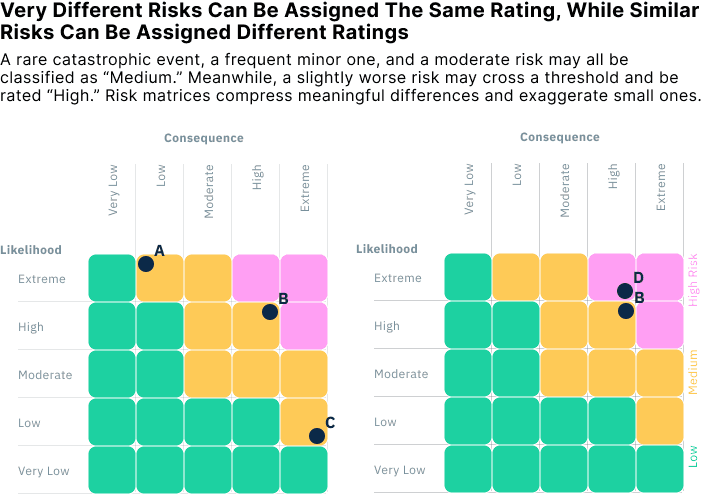
This is the core problem: the matrix compresses a wide range of risks into just a few labels. This “range compression” flattens distinctions that matter for decision-making and creates artificial discontinuities that can distort prioritisation.
As Cox (2008) showed, many typical risk matrices can only unambiguously rank around 10% of randomly selected risk pairs. The rest either tie or are misordered. That makes them poorly suited for ranking, screening, or prioritisation, especially when risks span several orders of magnitude, as they often do in infrastructure, health, or climate contexts.
If the goal is to understand and compare risks, we need tools that reflect how different risks really are, not ones that group them into rough bins and call it good enough.
Risk Inversion
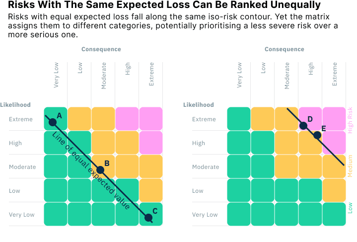
Risk matrices are often used to compare risks and decide which ones deserve the most attention. But because they divide risk space into broad categories, they can sometimes rank more severe risks as less concerning than milder ones. This is known as risk inversion, and it undermines one of the main purposes of a risk assessment tool: to support consistent prioritisation.
A common version of this happens when risks with opposite combinations of (negatively correlated) likelihood and consequence fall on the same matrix. For example:
Risk A: Moderate likelihood and consequence
Risk B: Rare but catastrophic
Risk C: Frequent but minor
These three risks could all fall along the same line of equal expected loss, that is, they pose the same average harm over time. Yet depending on how the matrix boundaries are drawn, the matrix might rate one as “High,” another as “Medium,” and the third as “Low,” and in effect recommend action on the “High” risk even though all three are equally severe when measured by expected loss.
This happens because most matrices are not designed to follow iso-risk contours (lines of equal expected loss). Instead, the category boundaries follow a grid that doesn’t align with the underlying math. As a result, risk rankings can become non-monotonic: the more severe risk doesn’t always get the higher rating.
In some cases, this misranking can be worse than random. If risk managers follow the matrix’s categories without digging deeper, they may prioritise lower-risk scenarios over higher-risk ones, simply because of how the boundaries fall.
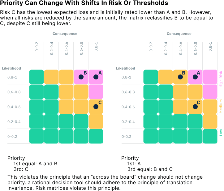
Suboptimal Resource Allocation
At their core, risk tools are meant to help us decide how to prioritise risk and how to allocate limited time, money, and attention to reduce risk most effectively. But risk matrices don’t help us make those decisions well. In fact, they can lead us to make irrational choices that violate basic principles of good decision-making.
A key reason is that risk matrices group risks into broad categories without regard to the cost or effectiveness of intervention. Two risks may be labelled “High,” even if one costs ten times more to reduce than the other, or if one responds well to mitigation and the other barely changes. The matrix offers no guidance on which option gives you the biggest reduction in risk per dollar spent. Therefore, good decision-making already requires additional information.
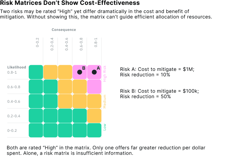
Worse still, matrices can reclassify risks in inconsistent ways, even when the underlying severity of the risks hasn’t changed. This happens because the boundaries between categories, how the grid is sliced, are arbitrary and coarse. Small shifts in a risk’s likelihood or consequence can push it across a threshold, changing its category and altering its apparent priority.
This undermines any attempt to prioritise interventions based on expected loss or cost-effectiveness.
For example, if you had three risks and then reduced their consequences all by the same amount, the risk priority could change. This violates a principle known as translation invariance: if you reduce every risk by the same amount, your priorities shouldn’t change.
If your goal is to reduce risk effectively, you need tools that reflect the actual magnitude of risk, the cost of mitigation, and the expected benefit. A grid of color-coded boxes can’t do that.
Ambiguity in Inputs and Outputs
Risk matrices often rely on categorising likelihood and consequence into qualitative bins like “Unlikely,” “Possible,” or “Catastrophic.” But these categories are inherently vague, and different people often interpret them in different ways. As a result, the same underlying risk can be rated very differently by different users, even when using the same matrix.
This ambiguity applies to both inputs (likelihood and consequence) and outputs (overall risk category). Users must make subjective judgments:
Is a 5% chance “unlikely” or “rare”?
Is a $10 million loss “major” or “moderate”?
Should a “High” risk trigger immediate mitigation, or just monitoring?
These choices often depend on context, past experience, and personal or organisational risk tolerance. That’s not inherently bad, judgment is part of risk assessment, but it becomes a problem when the matrix appears more objective than it is.
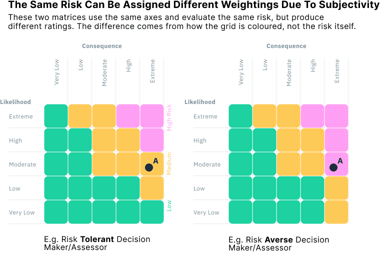
The way a matrix is coloured or structured can bake in implicit value judgments that go unexamined. One person’s “High” might be another’s “Medium,” simply because the matrix layout changed. In practice, different teams or organisations using nearly identical matrices can assign very different ratings to the same scenario.
For example, the figure below shows two risk matrices with identical axes and identical risks. But one was designed by a risk-averse decision-maker, and the other by someone more risk-tolerant. As a result, a risk in the same location is rated “High” in one and only “Medium” or even “Low” in the other.
This highlights a deeper problem: risk matrices don't just communicate risk, they can shape it. By locking judgments into a visual structure, they can obscure any nuanced analysis behind decisions and give a false sense of comparability. If we want consistent, transparent, and auditable decisions, we need tools that make these assumptions explicit, not abstract them away behind colour-coded categories.
Many of These Issues Arise from the [Mis]Use of Ordinal Data
Underlying many of the problems we've described is a more fundamental issue: the use (and frequent misuse) of ordinal data.
Risk matrices typically use ranked but non-numeric categories for both likelihood (e.g. “Unlikely,” “Likely”) and consequence (e.g. “Minor,” “Catastrophic”). These categories are ordinal: they have an order, but no defined or consistent distance between levels. Treating them as if they are quantitative or interval-scaled introduces distortions that affect every part of the matrix.
Here’s how this misuse plays out across the flaws we've covered:
#1. Arithmetic misuse of ordinal scales
In some settings, ordinal categories are assigned numerical values (e.g. 1–5) and then multiplied or added to produce a “risk score” (e.g. 3 × 4 = 12). This assumes that the difference between ranks is meaningful and consistent, which it isn’t. These risk scores are mathematically invalid and create a false sense of precision.
#2. False equivalence across the matrix
Even when no arithmetic is used, risk matrices imply quantitative comparisons between cells, for example, that risks along a diagonal (e.g. Rare–Catastrophic and Likely–Moderate) are equivalent. But because the axes are ordinal, this equivalence is not defined or defensible. Cox (2008) shows that this can lead to risk inversion, where a more severe risk is rated lower than a less severe one.
#3. Range compression due to limited ordinal bins
Ordinal scales with only 3–5 levels force very different risks into the same category. A wide range of combinations, e.g. minor but frequent versus rare but catastrophic, can be mapped to the same “Medium” cell. This contributes to poor resolution, one of Cox’s primary critiques.
#4. Ambiguity and inconsistency
Ordinal categories are vague and context-dependent. What one assessor considers “Major,” another may call “Moderate.” This leads to subjective inputs and variable outputs, especially in participatory or multi-stakeholder processes. Cox identifies this under Ambiguous Inputs and Outputs (3.4).
#5. Non-monotonic rankings
Because ordinal categories don’t behave like real numbers, small changes in input can cause large, non-intuitive shifts in risk classification. Two very similar risks might fall into different categories, while very different risks might end up with the same rating. This undermines the stability and fairness of matrix-based decisions.
In short, many of the flaws in risk matrices stem from treating ordinal scales as if they were quantitative. Unless those assumptions are explicitly justified, through careful scale design or validated thresholds, the resulting risk classifications should be treated with caution.
Toward Better Decisions
Risk matrices are familiar and easy to use, but the simplicity comes at the cost of transparency and technical accuracy. As we've seen, they abstract away nuance, introduce arbitrary thresholds, and, at worse, can be misleading.
The core problem is that risk matrices reduce a complex, continuous risk space into a handful of opaque categories. They obscure the assumptions and thresholds behind each rating, making it difficult to understand, justify, or act on the result.
If you’re required to use a risk matrix, by policy, regulation, or organisational convention, it’s important to acknowledge and understand the fundamental methodological limitations that exist. These tools can support discussion, but only when used with full awareness of their constraints.
To use them responsibly:
Make thresholds explicit and context-specific.
Define what counts as “High” risk (e.g., “>$10M expected loss with >1% annual probability”) and explicitly state the criteria for each risk category boundary.Use logarithmic scales for both likelihood and consequence.
Log-scaled axes reduce distortion, improve the resolution, and better align with quantitative risk measures. Log-additive matrices outperform linear ones in terms of avoiding misranking and range compression.Avoid pseudo-quantitative scoring from ordinal (numeric rankings of categories) inputs.
Treating ranked categories as numbers (e.g. 1–5) and multiplying them to produce a “risk score” creates a false sense of precision and validity.Accept that the matrix is a subjective tool.
The layout and colouring of a matrix reflect perception, not objective fact. Support subjective assessment with clear definitions, example anchor points, and training to ensure consistent interpretation across users.Use fully quantitative methods when the data and expertise allow.
Expected loss models, Monte Carlo simulations, and decision analysis techniques offer more rigorous and actionable insights.
Where possible, use continuous likelihood–consequence diagrams as an alternative. These are scatter plots that display individual risks based on their estimated likelihood and consequence. Unlike matrices, which assign risks to predefined bins, scatter plots preserve the underlying data and make the classification criteria explicit. Thresholds for what counts as “High” or “Unacceptable” risk can be drawn as visible boundaries or iso-risk contours, allowing decisions to be traced back to clear, defensible rules. This approach avoids the distortions of category-based grids and provides a more transparent foundation for comparing and prioritising risks.
Another way to present risk information in likelihood–consequence space is to encode the confidence in each estimate. The 2014 Norwegian National Risk Analysis plotted each identified risk by its likelihood and consequence, as in a standard scatter plot, but used point colour to indicate the strength of knowledge behind the assessment (low, medium, or high certainty). This approach keeps the raw likelihood–consequence relationship visible, while also making uncertainty explicit, a dimension that risk matrices ignore entirely. Showing both the position of a risk and the confidence in that position provides a more honest, transparent, and decision-relevant picture than a grid of colour-coded cells.
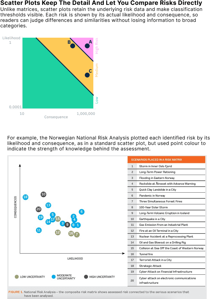
Approaches like the Norwegian scatter plot show that risk information can be presented in ways that retain nuance, make assumptions explicit, and even incorporate uncertainty, capabilities that traditional risk matrices lack. While matrices remain a simple and familiar way to present risk results, their well‑documented methodological flaws mean they should never be relied upon in isolation. As Cox (2008) noted, many practitioners regard risk matrices as “better than nothing,” but in many situations this is not the case. They can, in fact, lead to “worse‑than‑random decisions”, producing outcomes that are not just unhelpful, but counterproductive.
References and Further Reading
Cox, L. A., Jr. (2008). What’s wrong with risk matrices? Risk Analysis: An Official Publication of the Society for Risk Analysis, 28(2), 497–512. https://doi.org/10.1111/j.1539-6924.2008.01030.x
Duijm, N. J. (2015). Recommendations on the use and design of risk matrices. Safety Science, 76, 21–31. https://doi.org/10.1016/j.ssci.2015.02.014
Levine, E. S. (2012). Improving risk matrices: the advantages of logarithmically scaled axes. Journal of Risk Research, 15(2), 209–222. https://doi.org/10.1080/13669877.2011.634514
ISO 31010:2019. Risk Management—Risk Assessment Techniques
Proto, R., Recchia, G., Dryhurst, S., & Freeman, A. L. J. (2023). Do colored cells in risk matrices affect decision-making and risk perception? Insights from randomized controlled studies. Risk Analysis: An Official Publication of the Society for Risk Analysis, 43(10), 2114–2128. https://doi.org/10.1111/risa.14091
Sutherland, H., Recchia, G., Dryhurst, S., & Freeman, A. L. J. (2022). How people understand risk matrices, and how matrix design can improve their use: Findings from randomized controlled studies. Risk Analysis: An Official Publication of the Society for Risk Analysis, 42(5), 1023–1041. https://doi.org/10.1111/risa.13822
Risk Matrices Can Mislead More Than They Help
Although risk matrices are intuitive and familiar, they often obscure meaningful differences, exaggerate minor ones, and may even lead to decisions that conflict with basic principles of good risk management.
